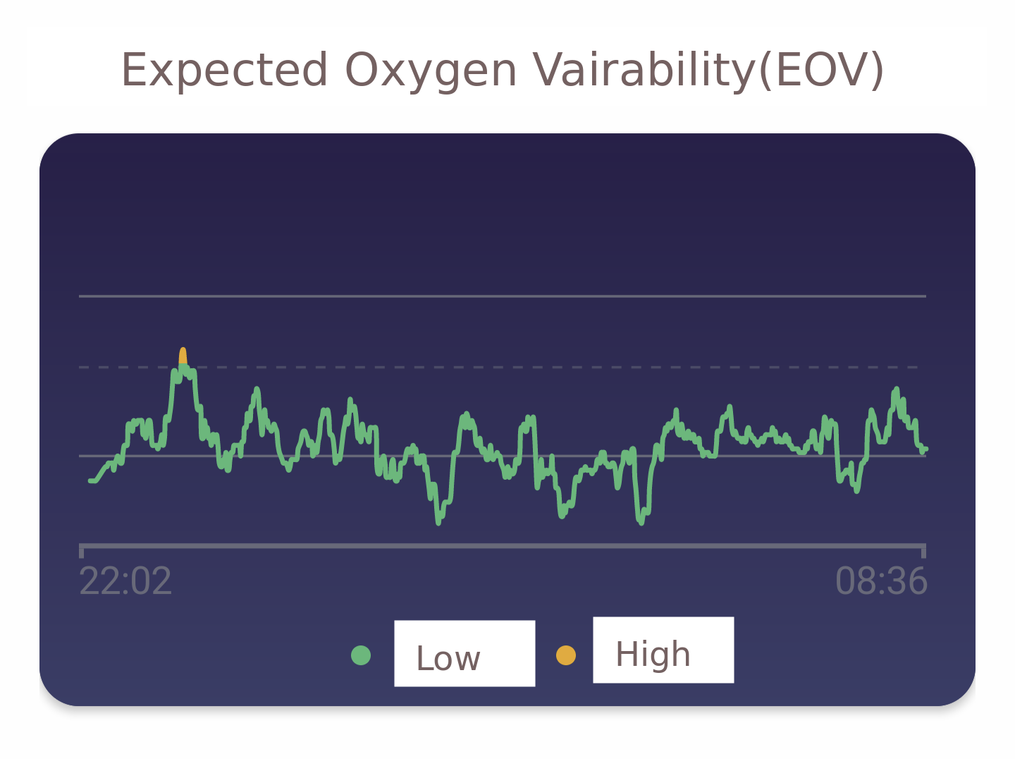
I am healthy and I wear a smartwatch while sleeping. Fitbit generated the following visualization of changes in estimated blood oxygen saturation variability (EOV). I think it is only the first derivative of some relative value that the device measured.
But what does the visualization even mean? YOu can see this curve shows a small interval where the line is yellow.
- Maybe the device was poorly aligned to my wrist during this interval.
- Maybe I was snoring or breathing less frequently
- perhaps it is normal for healthy persons, and somewhat expected, that the green line randomly crosses the dashed line once per night (the placement is somewhat arbitrary)
I have read the Fitbit EOV documentation (followed the "More info" link on phone app).
But my question is:
There is a horizontal solid line at the top.
What is the significance of that solid horizontal line?
Is this a line where it is definitely unhealthy if the green line reaches that level? Does it turn orange into red at that level? Is this a purely cosmetic line to improve the graphic design?
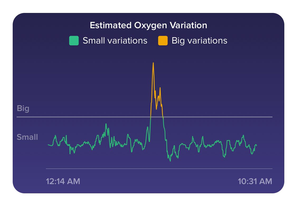
Has anyone here ever seen a EOV graph going above that upper solid line?

